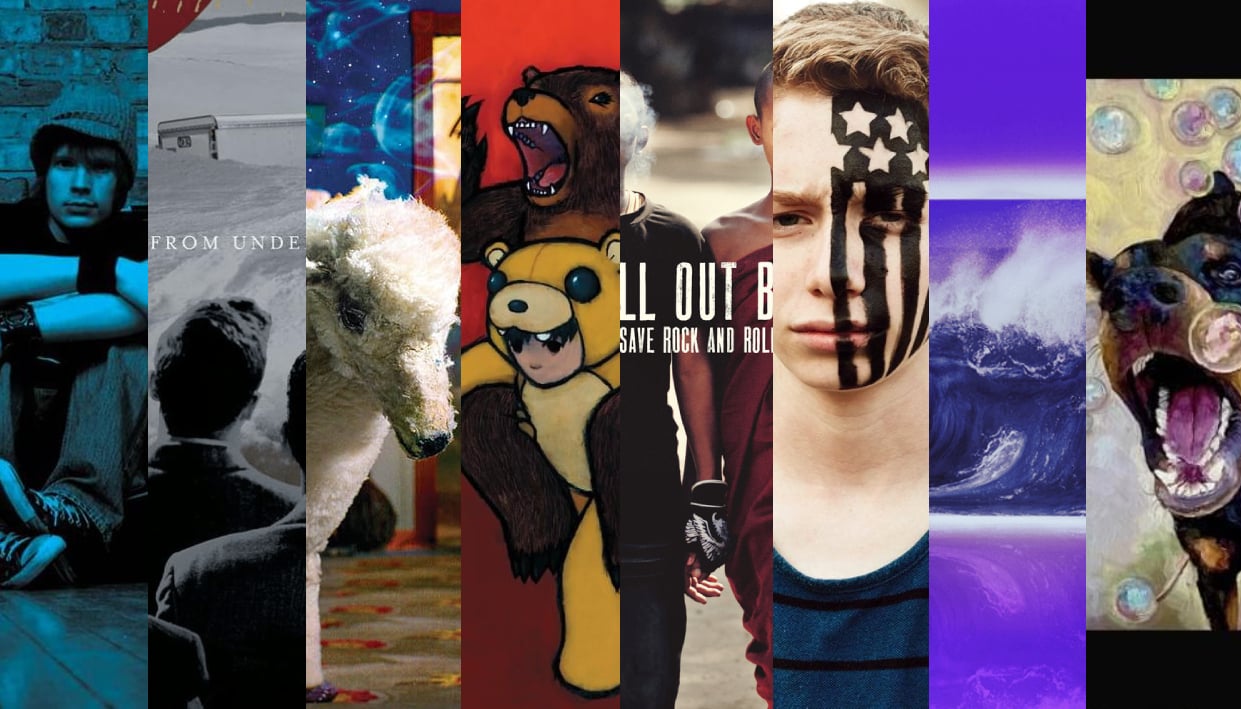
Over the last 20 years, few bands have imprinted themselves on alternative culture through their music and artwork more than Fall Out Boy. From their poetically introspective lyrics to their infectious attitude, they have provided us with some of the finest boundary-blasting pop, pop-punk and emo brilliance. And that artwork. Intricate, fascinating and genuinely genius, each record has been enhanced thanks to the artistry that adorns its cover.
But, much like everything, there is a best one. So that’s why we have taken it upon ourselves to rank those artworks from top to bottom. Join us…
8) M A N I A (2018)
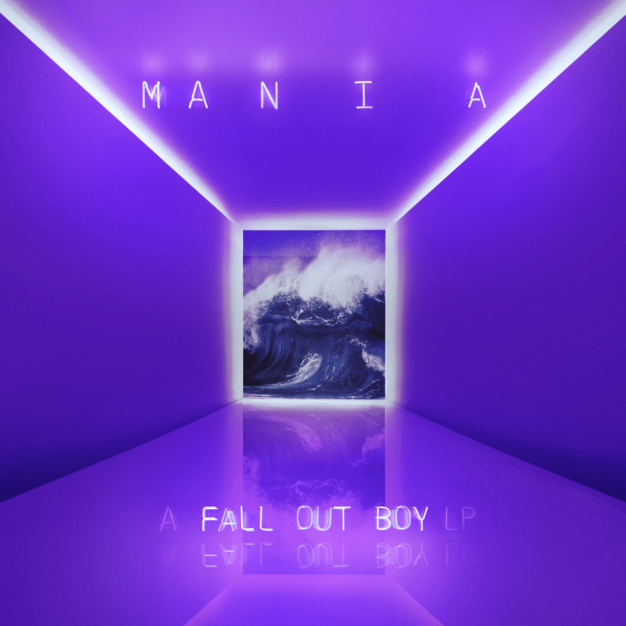
M A N I A is a truly misunderstood album, and that will become even more clear as the years pass by. Expansive, obsessively catchy and brimming with innovation and intensity that will soon be celebrated, its time will come. But in terms of its cover art, it’s a bit of a muchness. First off, the spacing of the title is a bit much, especially for those out there who type for a living. Plus, the simplicity of the purple room, colored because of Patrick Stump’s synesthesia, with the crashing wave at the end, doesn’t say as much about what we are experiencing as it should. There are some massive moments on this record, and perhaps the artwork should reflect that.
7) American Beauty/American Psycho (2015)
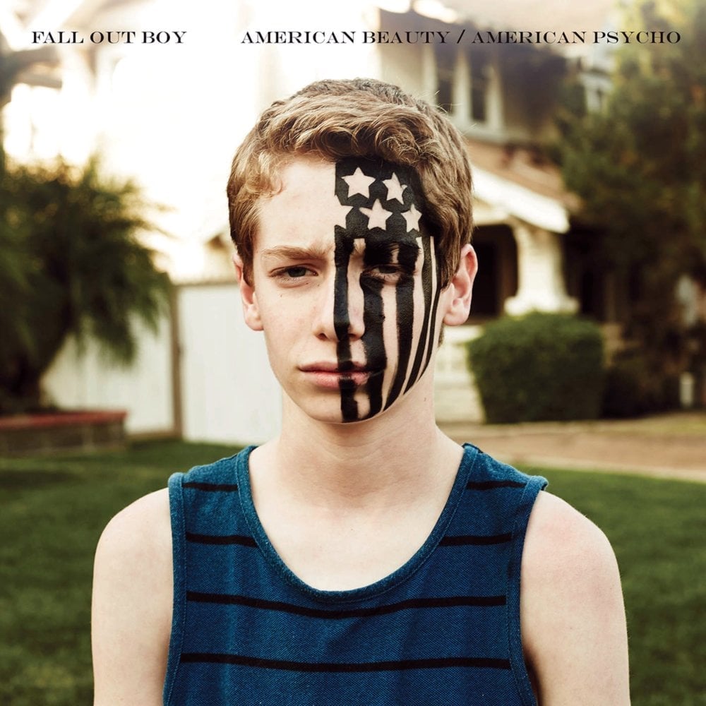
Now for a bit of a drama. Have you ever seen a more pissed-off kid with an American flag painted on his face? Apparently, the band asked Jake Karlan, the kid in question, to make something that was very dark and angry for the cover of American Beauty/American Psycho, and in that regard, they absolutely succeeded. But in terms of the poppiest Fall Out Boy album to date? It needs to add up. Despite that, we will always have the incredible cosplay and concert makeup looks that were inspired by this cover. Always a silver lining.
6) So Much (For) Stardust (2023)
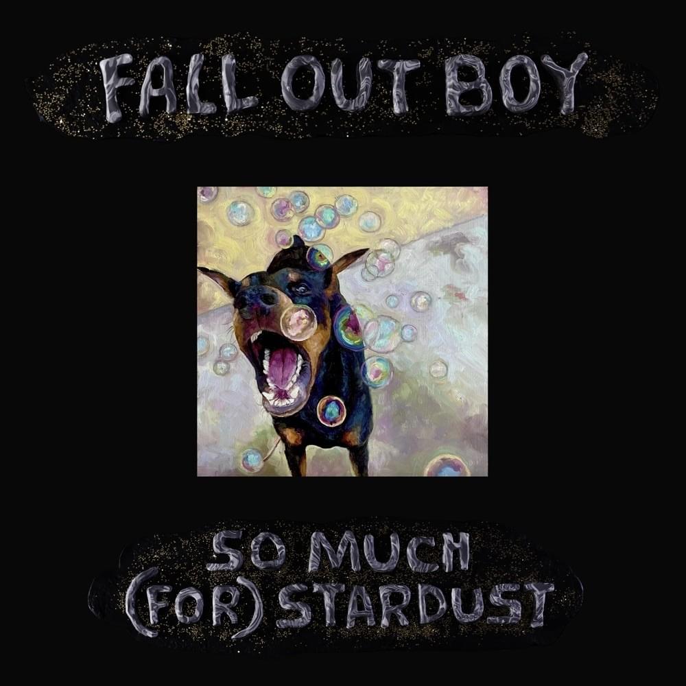
The band’s latest record keeps things simple but effective. We were first introduced to the lovely doggy via a stop-motion epic that was posted at Christmas of 2022, who was definitely put through a lot. And in terms of his place on the cover of this beautiful album, he fits in perfectly. Add in those bubbles, and you have more of that thought-provoking contrast that has helped define FOB over the years. Plus, asking people to put their pets on there is an inspired decision. So Much (For) Stardust’s artwork is bold, brash and beautiful, and that’s a success story in our book.
5) Save Rock And Roll (2013)
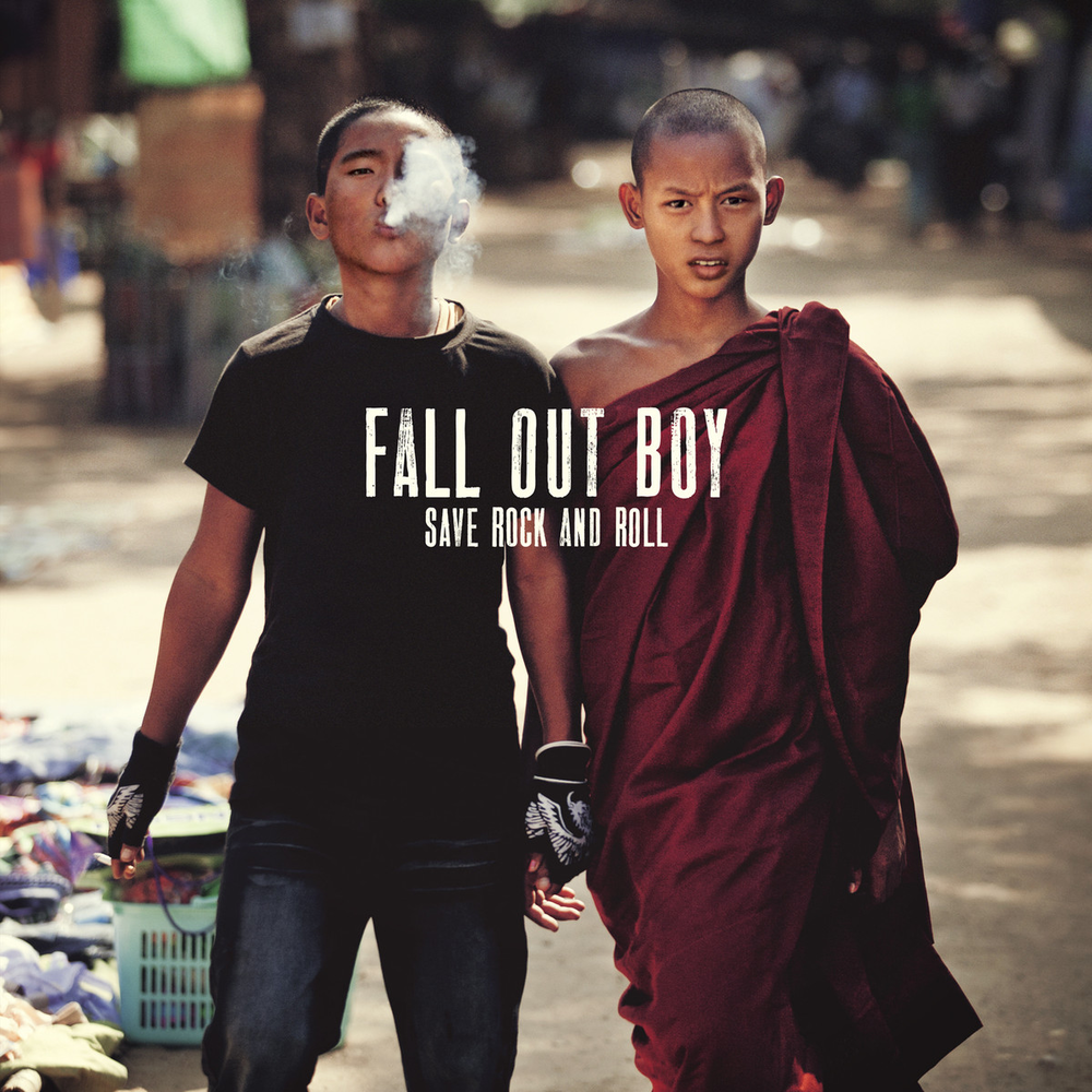
The Fall Out Boy comeback of 2013 is a moment that those who were there will be telling their grandchildren about. The culmination of it all was the fantastical pop opus that is Save Rock And Roll, an album that expanded the band’s empire as well as raised a few eyebrows from old-school supporters. Not least with the title and the artwork, a photo taken by Roger Stonehouse. The image of two young boys – one in traditional Buddhist monk robes and the other smoking in a black tee – feels like a powerful statement on how times change. Traditions stay the same, but change is still possible. A summation of bringing together the old and the new that the band did so brilliantly on the record, it feels like an iconic image that could describe many a journey or experience within the alternative music sphere.
Take This To Your Grave (2003)
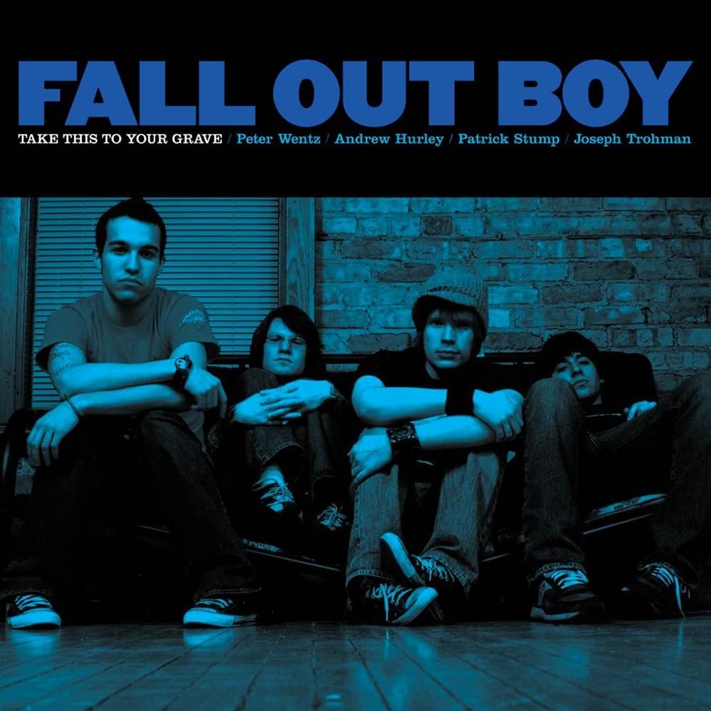
Every band has to have a cover with them standing on it. It’s an unwritten rule you must adhere to when you decide to make music for a living. Some of them are average. With an awkward pose, lousy lighting and cringy boy band energy, it can be a bit of a mess. But that’s not what has happened with Take This To Your Grave. With the blue hue and the gang mentality of the boys sitting on the couch together, there’s something properly hardcore about this shot. It’s iconic for a reason and an incredible way to introduce yourself to the masses.
Folie à Deux (2008)
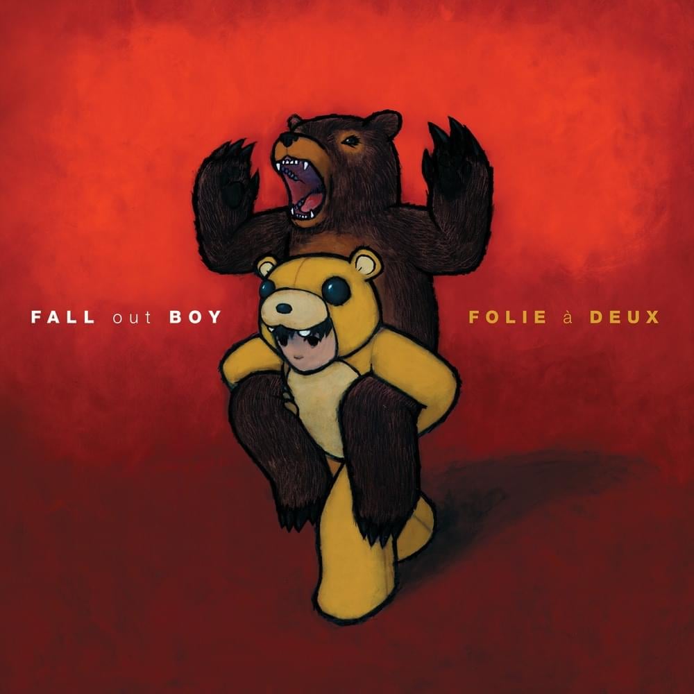
Soon to be the name of the new Joker film, Folie à Deux, or The Madness Of Two, possibly features the cutest artwork that Fall Out Boy has ever produced. The little boy dressed as a bear holding up a real-life vicious bear may seem cuddly and adorable on the surface, but it may have a deeper meaning. That allowing those we idolise to stand upon our shoulders lets those very idols reach heights that they don’t know how to behave in. That may be relevant to the ever-increasing popularity of the band and what people expected from them. It may relate to culture on a broader level. Perhaps it is relevant simply to our friends and the company that we keep. Whatever it is, the painting by Luke Chueh is now rightfully as iconic as the songs that inspired it.
From Under The Cork Tree (2005)
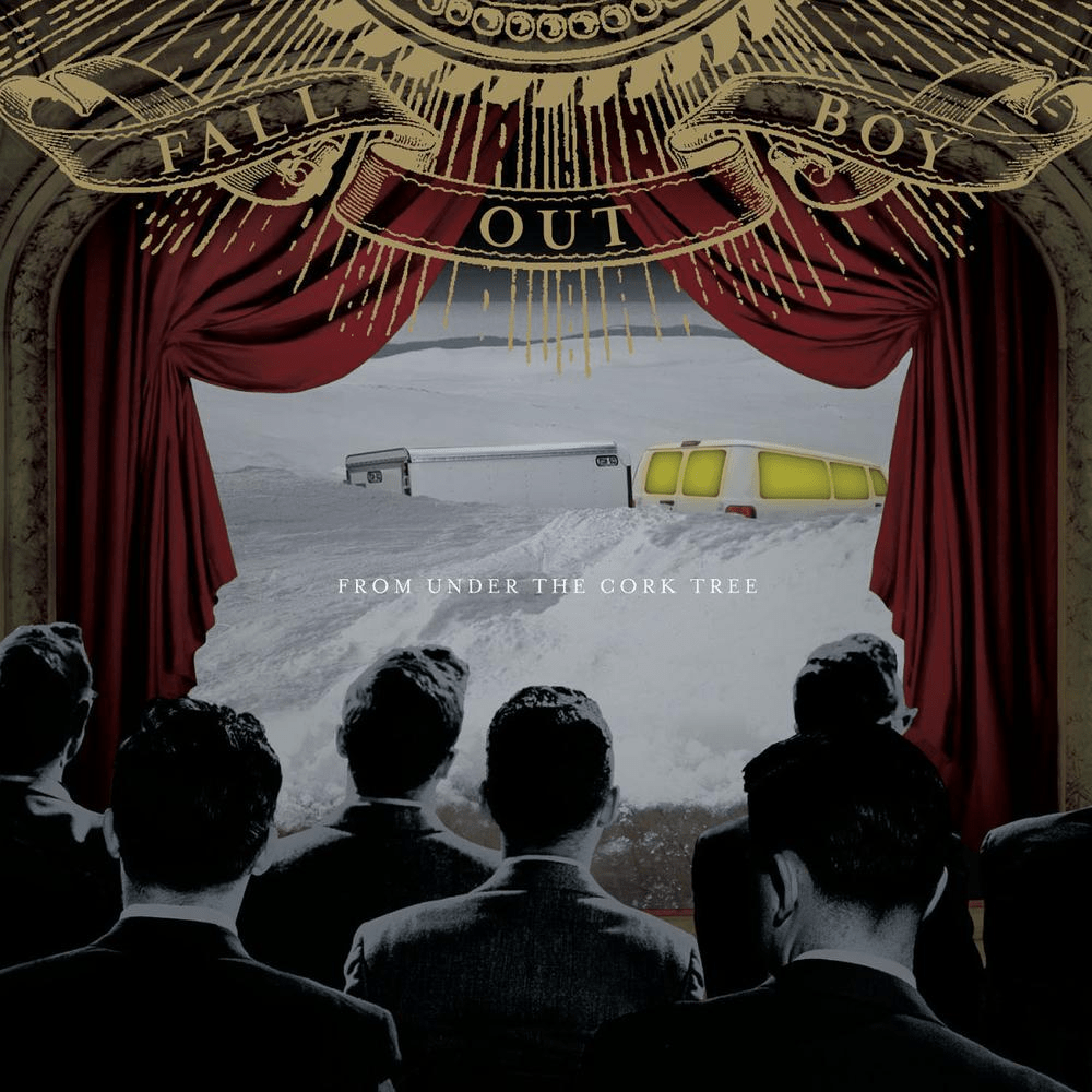
The artwork for Fall Out Boy’s most critically and commercially acclaimed album, From Under The Cork Tree, comes with some backstory. The van and trailer seen at the centre of the cinema scene references something that happened to the band. They were in a car accident on the way to New York to film their video for “Grand Theft Autumn /Where Is Your Boy“, which almost makes the voyeurism of the affair a bit more affecting and uncomfortable. However, it’s this sort of self-referential brilliance that has helped the band become the legends that they are, and it perfectly reflects the heart-on-sleeve revelations of the record as well. Very good artwork. Very good album. Nicely done.
Infinity On High (2007)
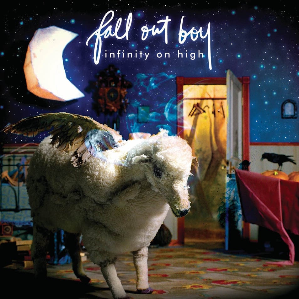
Ah, Franklin, how’s it going? The title of Fall Out Boy’s essential 2007 album is pulled from a Vincent Van Gogh quote sent in a letter to his brother. “Be clearly aware of the stars and infinity on high. Then life seems almost enchanted after all”. These are gorgeous words, we think you will agree, but they are also ideally suited to the dream-like display that makes up the artwork. We’ve already mentioned Franklin, the winged sheep. But then there are stars, a moon, a crow, a birdcage and an open wardrobe. All fantastical, all open to interpretation, all beautiful in their own way. Representing both a transitional period but also a realisation of how wonderful the world can be when you let life wash over you, that’s why Infinity On High is No.01. Because it can mean anything you want it to, much like every other aspect of life.